It’s been some 45 days since the White House declared COVID-19 a National Emergency and the bulk of us became largely confined to our homes. As people begin to agitate for the end of the quarantine and a number of states begin to open up, I thought I’d offer up a loose collection of data-driven thoughts on the quarantine we’ve all been experiencing. These insights are based on mobility data measured as Vehicle Miles Traveled (VMT). While this is an imperfect metric, we can use the reduction in VMT since before the pandemic as a rough proxy of how effectively we have been adhering to the quarantine.
The Quarantine Was Effective, but Effectiveness Varied by State
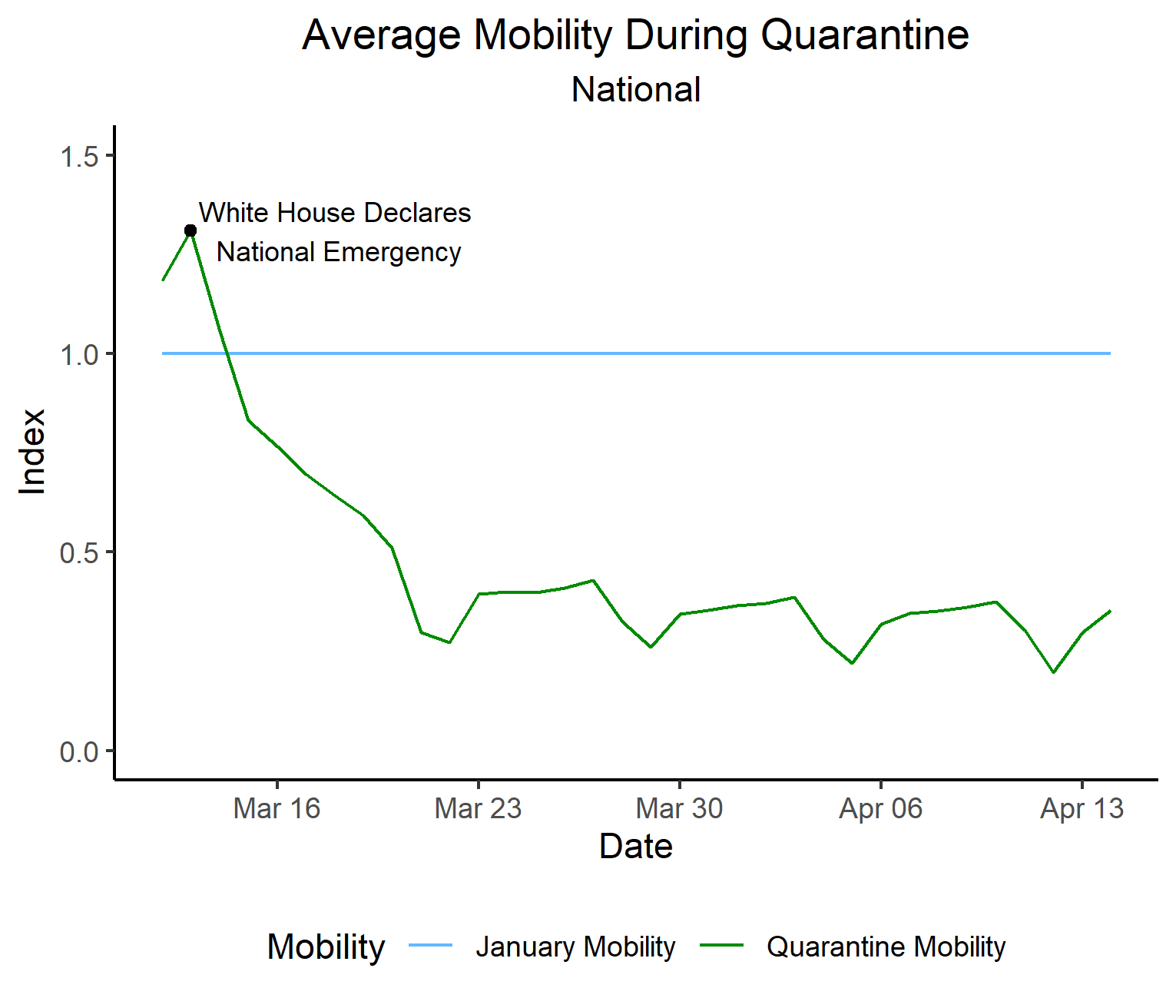
The first observation is that the quarantine was effective, which is probably obvious from a quick glance outside. Average mobility by county fell by approximately 65% when compared to January (the troughs you see are weekends).
Some states adhered to the quarantine more seriously than others

Here, we can observe that the Southern states reduced their movement less than the rest of the country. A similar phenomenon can be observed to a lesser extent among the Western states. What could explain this disparity? Let’s discuss the obvious: the Northeastern states like New York, New Jersey, and Massachusetts have been hit hardest by COVID-19. Southern and Western states, less so. Obviously, you would expect that states hit hardest by the virus would observe the quarantine the most. Interestingly enough, if you control for a few key variables like population density (more on that later) and education, there is very little relationship between COVID-19 infection rate and mobility. For instance, doubling Mississippi’s COVID-19 infection rate would decrease mobility by less than half a percentage point when education and population density are taken into account.
Let’s try a different tact. Recall that mobility has been defined as Vehicle Miles Traveled (VMT). The West and South have less population density than the rest of the county and their inhabitants are far more spread out on average, so mobility reduction measured as reduction in VMT may have been capped (i.e. basic amenities like the grocery store are much further away). So we can develop a model that allows us to control for population density and imagine a world where every county in the United States has the same population density. Then we can calculate mobility in this hypothetical world. The results are as follows:

As you can see, the Western states fare considerably better when adjusted for population density — on par with the Northeast in fact. On the other hand, the Southern states continue to lag behind despite this adjustment, despite having more confirmed cases and deaths than their Western brethren. It could very well be that states in the deep South took the quarantine less seriously than the rest of the country.
Infection and Mobility


Political Leanings and the Quarantine
Unfortunately, from the get-go, COVID-19 was highly politicized. President Trump initially compared the virus to the common flu, called concerns about it a democratic “hoax”, and declared that the death rate was lower than projected by public health officials based on nothing more than a “hunch.” There is evidence that this initial downplaying of the virus by the administration had a downstream effect — polls show a partisan divide on the dangers of COVID-19. This effect also bears out in the mobility data.
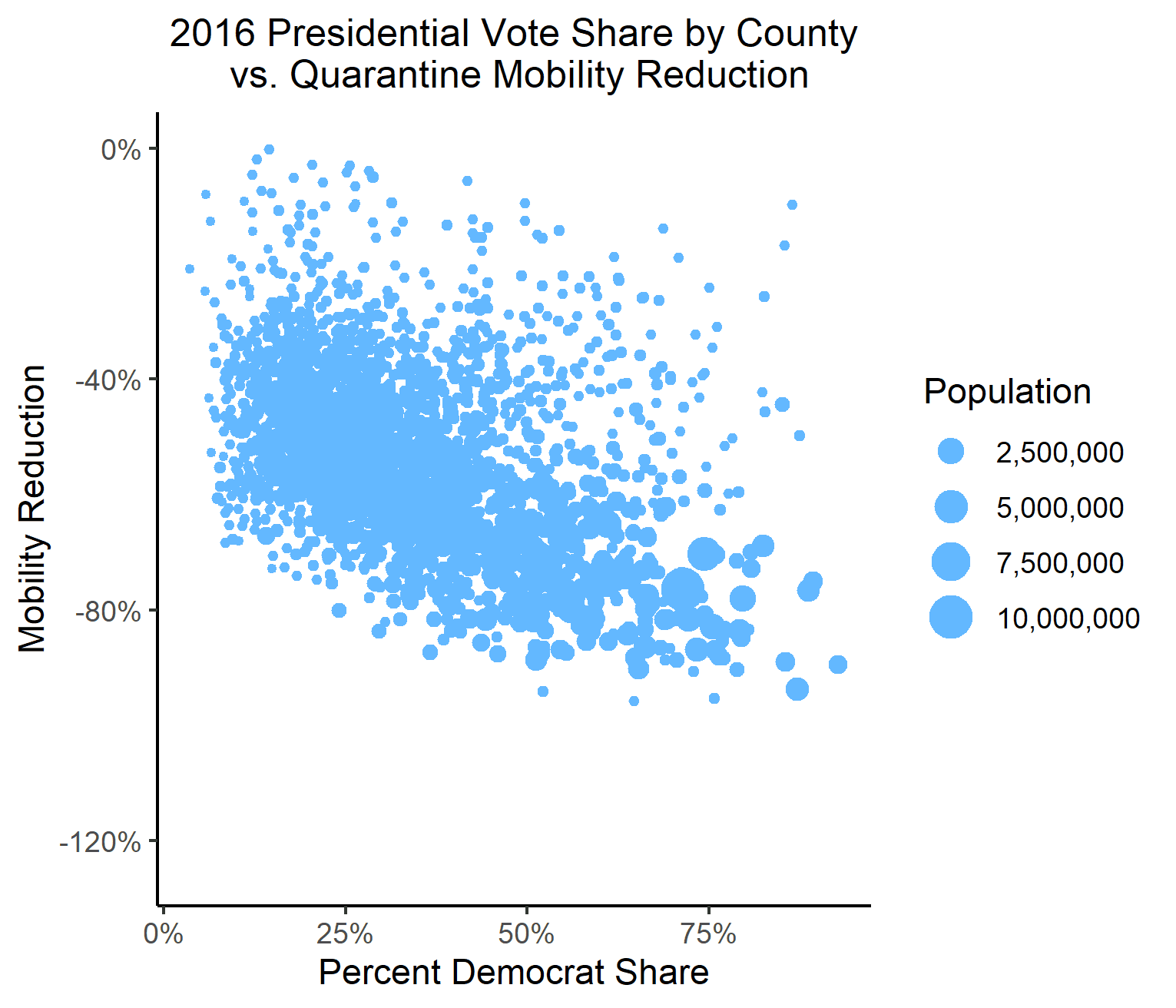
As we can see, counties that voted blue were more likely to observe the quarantine, and to a greater extent. This relationship persists when variables like education, population density, and income are controlled for.